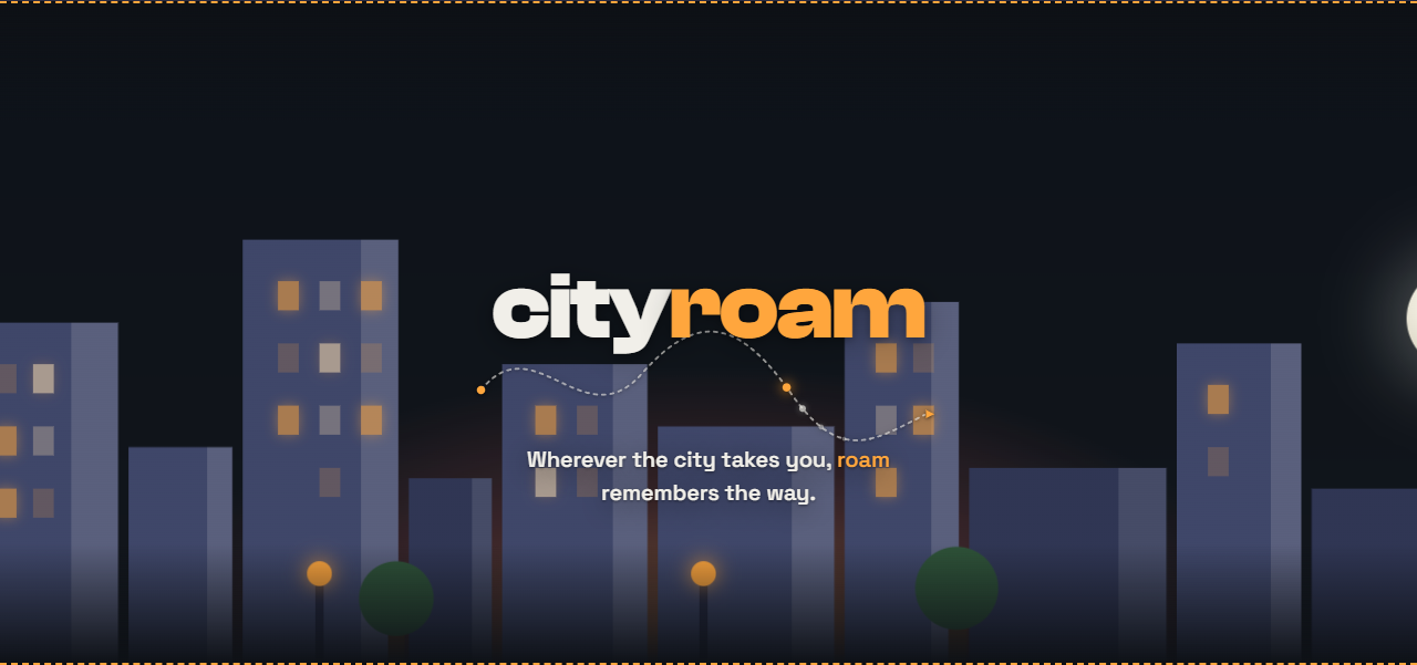
Cityroam’s design system: route, skyline, and night-rider clarity
A strong product identity is often less about decoration and more about discipline. The Cityroam design system is a good example of that: it does not try to be everything at once. It picks a few strong ideas and repeats them consistently.
The core directive is simple: the visual language should feel like the product’s actual behavior. That means route, movement, city lights, and clarity over glitz.
The palette says what the app is for
The design system keeps a dark base and adds a limited accent palette. Amber represents the city itself: streetlamps, windows, destination markers, the glow of the route endpoints. Teal is held back for actual route/GPS functionality rather than the logo itself.
That distinction matters. A brand can become noisy when every color starts trying to communicate everything. The design system avoids that by assigning each color a job. The app’s dark background stays stable and premium; the accents do the work of highlighting the meaningful parts rather than competing with them.
The same idea carries through the typography. The wordmark is bold and geometric, designed to feel modern and confident without slipping into empty trend-chasing. The body type and telemetry language remain precise and readable, which is very much in character for a bike/scooter/ride-tracking product. The brand does not shout; it just stays legible in the moments that matter.
The route mark is the real logo idea
The biggest design decision in the Cityroam identity is the mark itself. It is not a wheel, a wave, or an abstract city silhouette. It is a route: a start point, a curved line, and an X-shaped destination.
That is a powerful choice because it encodes the product’s actual value proposition. The app is about movement through a city and the ability to take a route seriously. The logo becomes a direct visual shorthand for that idea, not a generic “tech brand” symbol.
The docs are explicit about why this change matters: the earlier visual experiments had enough polish to feel good, but the route-based mark was the one that felt both beautiful and accurate. It is specific to ride tracking. That specificity is the reason it works.
Motion reinforces the product story
The Cityroam concept also includes a built-in motion language. The skyline loops behind the wordmark, the route dot glides along a wandering path, and the overall treatment stays ambient instead of becoming a full hero reveal.
This is a smart design constraint. The motion is never the main event. It behaves like a tool in the background, not a flashy demo. At the same time, it is expressive enough to communicate the product’s point: this is a city, this is a route, and this is movement.
The same system respects reduced-motion settings, which is exactly the kind of small but meaningful detail that separates a product identity from a random landing-page theme.
The site should feel like the product
The marketing site is meant to transmit the same qualities as the app: dark, precise, and route-focused. The Cityroam docs are careful about this. The idea is not to build a bright consumer lifestyle brand. It is to build a product story that matches the app’s real use case: city travel, route awareness, and ride telemetry.
That is why the visual system is strong. It does not rely on a generic startup aesthetic. It does not borrow from loud scooter-fuel fantasy. It instead leans into a clear, useful, urban language that feels earned.
That clarity is probably the most important feature of all.
The live interface proves the system
The actual Cityroam page shows the system in use rather than leaving it as a moodboard. The features section presents board settings, trip detail, mode cost, route planning, range verdicts, activity history, ride history, a home-screen widget, and one settings hub. The screenshots sit inside the same dark visual world as the wordmark and city illustration.
The product details also give the visual system substance. Range is described as “Doable,” “Cutting it close,” or “Not enough charge,” calculated from rolling resistance, aerodynamic drag, drivetrain efficiency, elevation, wind, and current battery. That is a much more memorable product story than a generic dashboard full of numbers.
Privacy is part of the design language
The site gives local-first behavior the same prominence as the feature list. Connection keys stay on the device in Android’s hardware-backed keystore. There are no ads, analytics SDKs, data brokers, or data sales. GPS is used when a ride is active, finished rides are stored before any network call, and syncing waits until a connection is available.
That is not only a technical policy. It shapes the product’s character: calm, direct, and respectful of the rider’s attention.