How the Cityroam website turns product reality into a landing page
The best product websites do not just explain a feature list. They frame the product around the real human problem it solves.
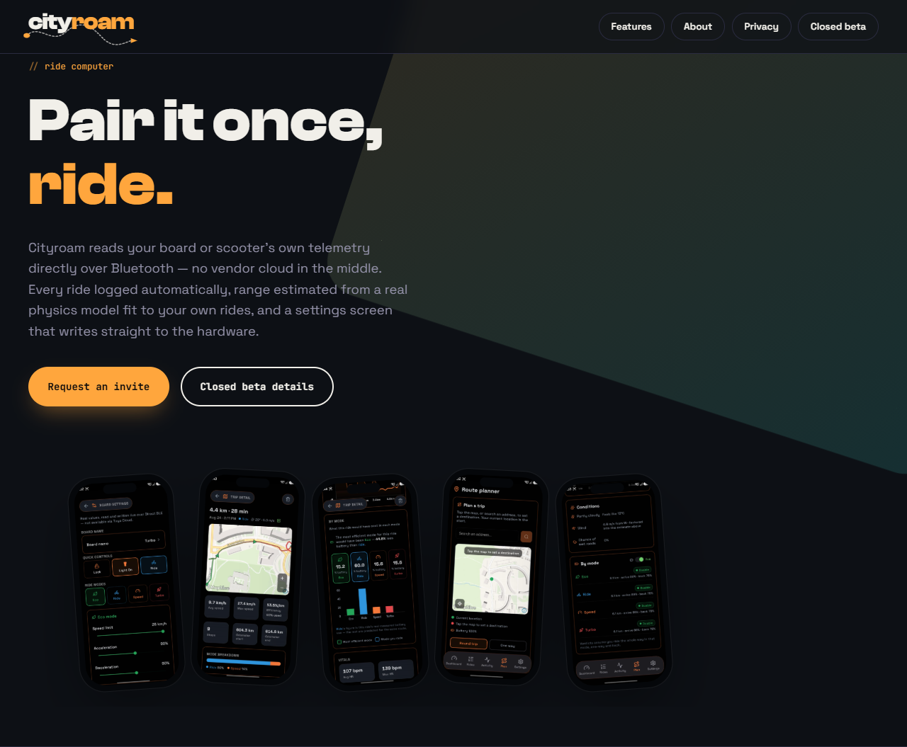
That is the idea behind the Cityroam website: the brand, layout, and motion system should all reinforce the same story. This is not a generic electric mobility landing page or a performance marketing template. It is a site for a ride computer that reads hardware telemetry, records real trips, and answers the practical question of how far a rider can get on the current charge.
The site has to say what the app actually does
The live page makes this point very clearly. “Turbo” was a loud, engine-like name, but it did not match the actual behavior of the product. Cityroam does. The site presents the app as something grounded in direct Bluetooth telemetry, route planning, physics-based range estimates, and movement through actual urban space rather than a generic speed claim.
In other words, the website is not there to exaggerate the product. It is there to make the product’s truth feel obvious. The route is the feature. The city is the context. The rider is the actor.
That is a much stronger foundation for storytelling than a list of flashy metrics. The page even explains the less glamorous choices: GPS starts when the board connects, recording starts from wheel speed without a button, and a completed ride is saved locally before any network sync.
Route-first storytelling
The Cityroam design system uses a route-centric icon, a skyline backdrop, and a small animated route dot that moves through the wordmark. These details are not just decorative. They structure the page around the way the app works. The route metaphor is carried through the brand, and the site’s visual language stays consistent with it.
The result is a landing page that feels like a product story rather than a brochure. You are not just looking at a logo and a bunch of claims. You are seeing the shape of a ride through a city, with start and destination points, motion, and place all wrapped together.
That kind of continuity is exactly what makes a brand feel trustworthy. The site and the app are saying the same thing.
Built for night riding, not for generic app aesthetics
The palette reinforces the same idea. The dark base ensures the interface feels at home in real-world nighttime riding. Amber gives the brand a human, lit-city mood. Teal is reserved for route-related UI, which keeps the product’s actual purpose visible without cluttering the whole brand with too many competing meanings.
This is a good example of design restraint. The site is not trying to make the app look like a lifestyle startup or a race product. It is trying to look like a serious ride tool that lives in actual streets and real routes.
Closed beta, stated honestly
The site does not hide that Cityroam is still invite-only. The closed-beta section asks prospective testers for a few details about their commute and board or scooter, then promises a personal reply with an APK and test account. Google Play distribution may come later, once there are enough users and the product is ready for a wider release.
That section is important because it turns the landing page into an invitation to participate, not just a sales pitch. It also sets expectations clearly: Tynee products are currently supported, NAVEE support is still being built, and riders should set everything up before moving, wear a helmet, and follow local traffic laws.
Independence and privacy are visible features
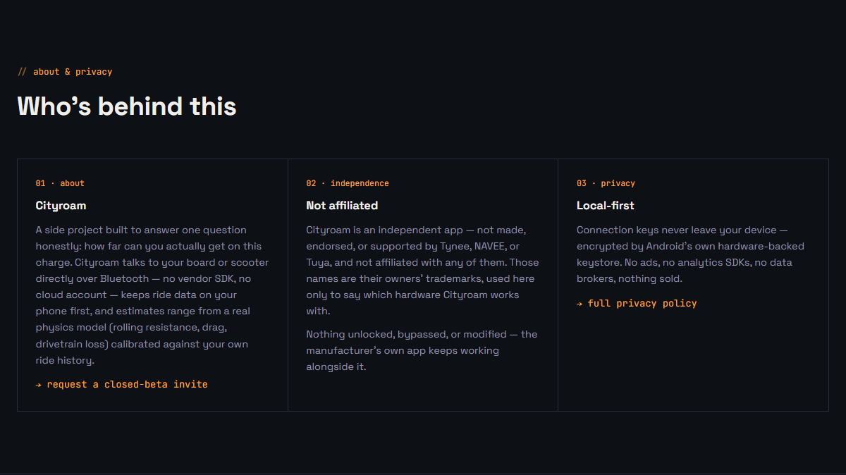
The about section says Cityroam is independent and not endorsed by Tynee, NAVEE, or Tuya. It also explains that the manufacturer’s app keeps working alongside Cityroam. The privacy section is equally direct: keys stay on the device, there are no ads or analytics SDKs, and nothing is sold.
Those details make the site feel more trustworthy because they answer the questions a real tester has before requesting an invite.
The real job of the landing page
A landing page for a product like this should do two things well:
- explain the product’s core value without sounding vague
- create a visual identity that feels consistent with how the product works in practice
The Cityroam site does both. It makes the route, the destination, and the city the organizing principle of the experience, then backs that story with concrete feature behavior and a clear beta path. A person landing on the page can understand almost immediately what this product is for and how to try it.
That is what good product marketing should do: turn product truth into a clear, memorable story.